Phone-First or Phone-Frustrating? A 2026 Mobile Preview Tune-Up

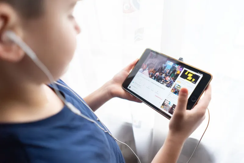
Most adult preview sessions do not start at a desk. They start on a couch, in a parked car, on a lunch break, or in bed with the phone tilted at a dangerous angle. That makes mobile the real testing ground for any streaming site. A preview can look polished on a laptop and fall apart on a phone: buttons too small, audio that fires without permission, redirects that stack up like airport layovers. This is a practical checkup for the pocket-sized version of the experience.
The Five-Minute Phone Test
Pick a preview you have not tried before. Open it on your phone, not on Wi-Fi if you can avoid it, and pay attention to the first minute. How many taps does it take to reach actual video? Does the page jump around while loading? Does anything start playing sound before you ask it to? Does the back button take you back, or does it send you somewhere new? A good mobile preview should feel boring in the best way: tap, load, watch, close.
Where Mobile Previews Quietly Fall Apart
Fake Play Buttons and Phantom Taps
The classic mobile annoyance is the play button that is not a play button. You tap the triangle, and instead of video you get an ad, a survey, or a new tab. Sometimes the real play button is a tiny target hidden near the corner, while the fake one is big and centered. On a phone, this is especially sneaky because your thumb covers the screen and you cannot always see what you hit. A trustworthy preview has one obvious play control, and it does what it says.
Redirect Chains and the Back-Button Tax
A single tap should not open four tabs. Redirect chains are a mobile problem because each hop costs time, data, and patience. They also break the back-button contract: you expect to return to the previous page, not land on a completely different site. If closing a preview feels like escaping a timeshare presentation, the site is not respecting your time. A clean preview keeps you on one domain through playback and gives you a close button that actually closes.
Autoplay Audio in Public Places
Autoplay video is one thing. Autoplay audio is a social hazard. On a phone, a preview that blasts sound the moment the page loads can turn a private moment into a public one. Good mobile design mutes by default and lets you opt into sound with a tap. Better design does not autoplay at all until you press play. This is not puritanism; it is basic courtesy for anyone who has ever opened a link on a bus.
Tap Targets Built for Desktop Mice
Desktop designers love tiny X buttons and close icons tucked into corners. On a phone, those targets become thumb puzzles. The same goes for volume sliders, category filters, and 'next' arrows. If you need two hands and a steady grip to close an overlay, the layout was not built for mobile. A clean mobile preview uses large, spaced tap targets and keeps the important controls away from the edge of the screen, where palms and cases interfere.
Landing Pages That Eat Your Data Plan
A preview page should not cost more data than the preview itself. Heavy landing pages with autoplay ads, multiple tracking scripts, and uncompressed images can burn through a data cap before the video even starts. In the US, where mobile plans vary wildly and 'unlimited' often has a throttle point, that matters. A respectful mobile preview loads lean, lazy-loads images, and gives you a sense of the data cost before you commit to a long clip.
What a Clean Mobile Preview Should Look Like in 2026
A good mobile preview is not fancy. It is fast, legible, and predictable. You should be able to open the page, see one clear play control, and start watching without a scavenger hunt. The player should have large pause and volume buttons, a scrub bar you can actually grab, and a close option that returns you to where you were. Audio should be off until you turn it on. Redirects should be rare or nonexistent. The page should not ask for notifications, location, or a newsletter signup before it shows you the thing you came for.
It should also be honest about limits. If the preview is 30 seconds, say so. If the full scene requires an account, say that before playback. Mobile users are often multitasking, and a site that respects that context earns more trust than one that treats every tap as a chance to interrupt.
A Quick Phone Checkup Before You Commit
- Open the preview in a private tab if you want a cleaner first look.
- Turn your media volume down before you tap play.
- Count the taps to actual video; more than two is a warning sign.
- Look for one real play button, not a decoy.
- Check that closing the player leaves you on the same site.
- Notice whether sound starts without your permission.
- Try the back button once; it should not strand you.
- Watch the first 10 seconds for a paywall modal or countdown.
- Check your data usage after a short clip if you are on a capped plan.
None of this requires technical expertise. It is just attention. The phone is where a site's manners show. If the mobile experience is clean, the preview is probably being treated as a product. If it is a maze of taps, redirects, and surprise audio, the preview is being treated as a traffic opportunity.
The Free-XTV Take
A mobile preview should feel like a sample, not a stunt. Free-XTV readers are not asking for much: a real play button, a clear length, no audio ambush, and a close button that closes. That is the baseline for 2026. Anything less is not a mobile strategy; it is a thumb tax.